Call to action placement
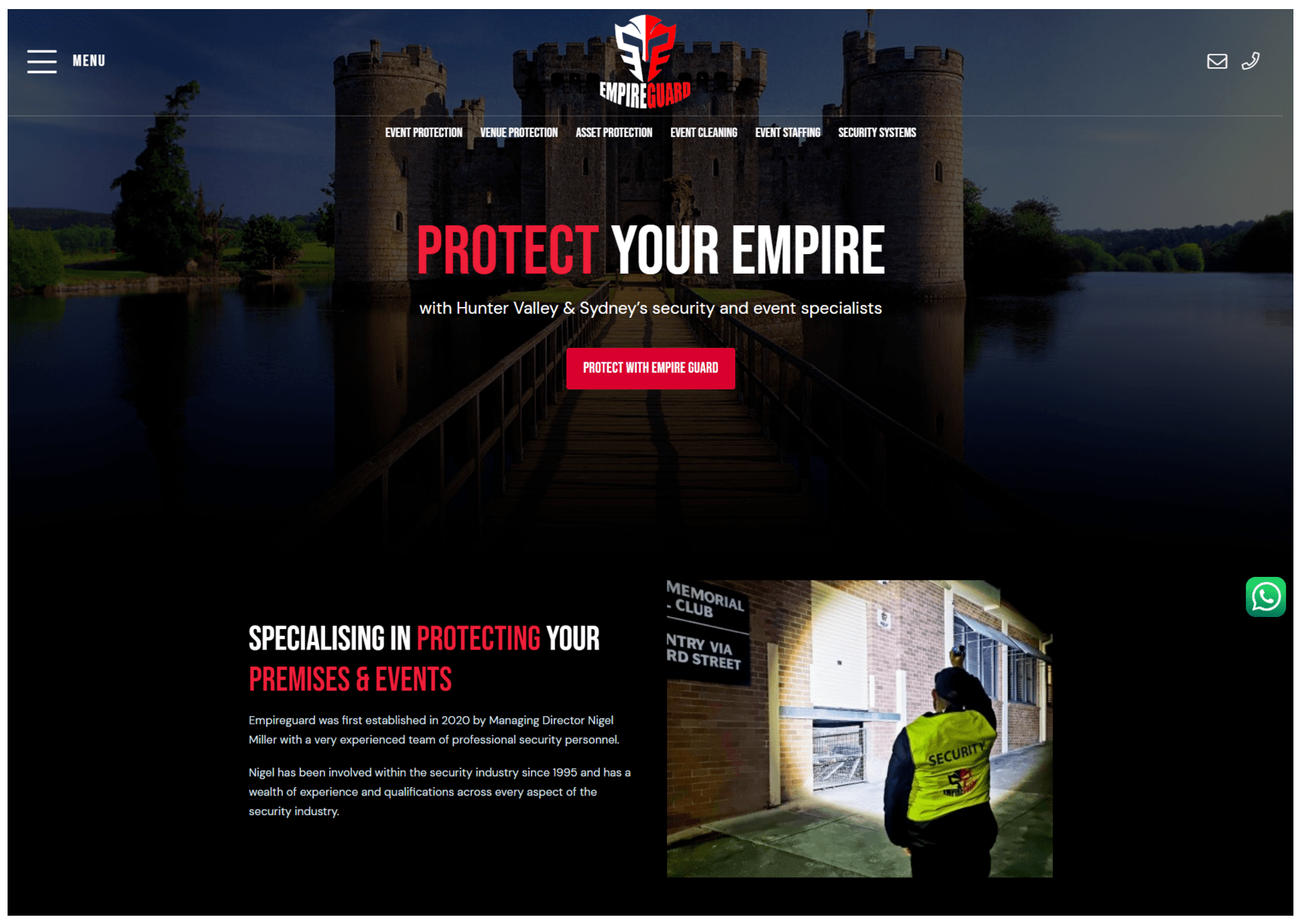
When you open a webpage, everything that is visible immediately before scrolling is above the fold.
If you’ve spent any time reading about website design, you’ve probably read that you must always have a call to action above the fold.
This isn’t true.
Where to put the call to action depends on the motivation of the visitor.
Certain visitors are motivated to click that button, they’ve largely made their mind up before visiting the website. They are a pre-sold prospect. In these cases, placing a call to action immediately makes sense – keep that motivation going.
Uncertain visitors are not motivated. You need to convince them about the value of your proposition. This takes good, well-thought out content that shows how you will solve their problem. You can’t do that above the fold. Asking for a commitment so early on the website is self-defeating – it can lead to a negative experience and a high bounce rate.
The call to action should be placed in a position where the visitor will be most persuaded to act upon it.
And that is why the “above the fold Call to Action argument” is actually a red herring.
To work out where your call to action should be, talk to kurl web on 1300 888 307.


