How to Make your Website More Accessible
Tips to Improve Website Accessibility
Ensuring your website is accessible to all users makes sense. Not only is it good manners to make it usable for all members of society, but as around 4.4 million people in Australia¹ have some form of disability, an inclusive website could significantly expand your customer reach!
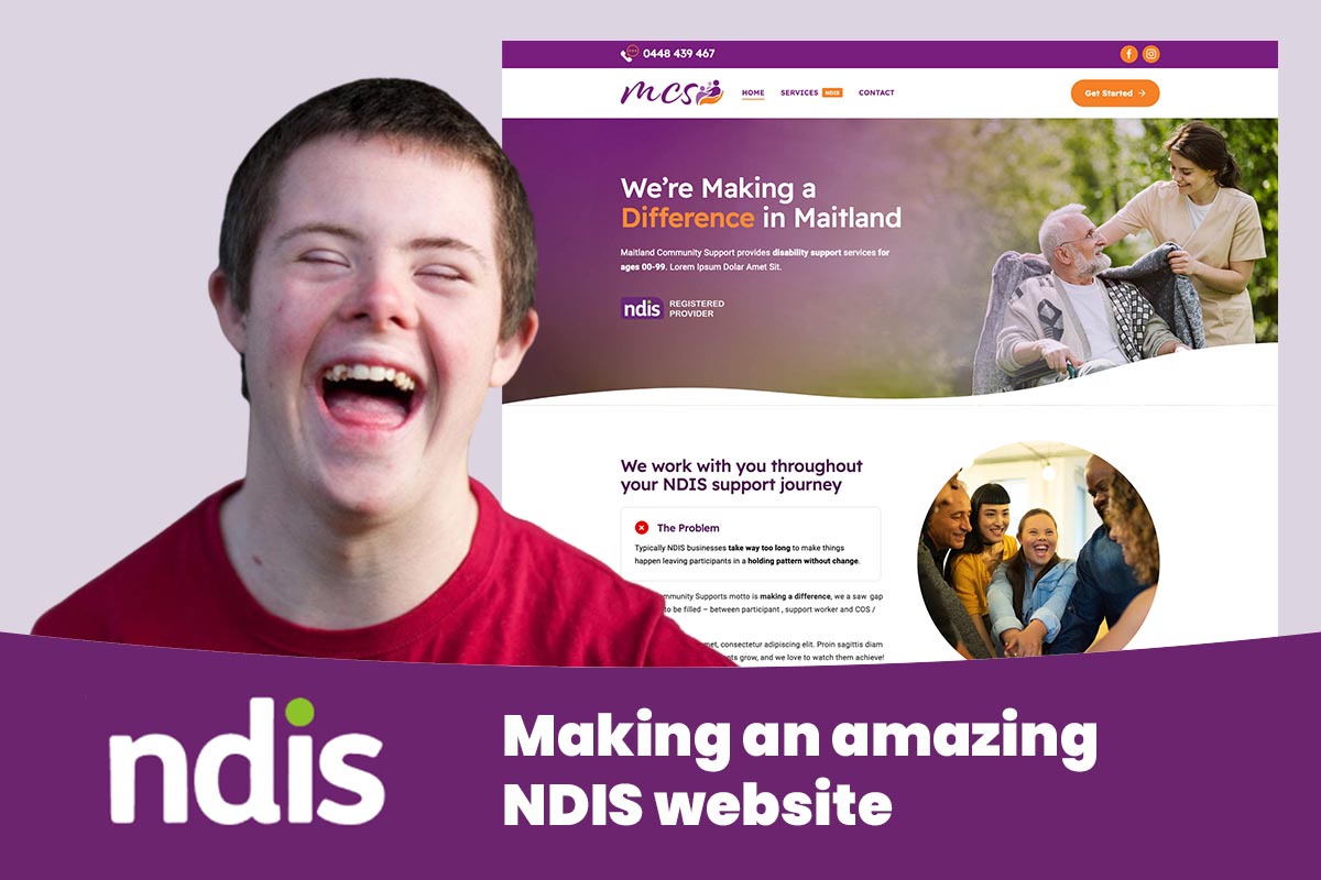
Hunter Valley web design professionals kurl web regularly work with clients to audit websites and implement changes to improve accessibility. With a long list of NDIS business clients, accessibility has been front of mind for the Maitland web design team for quite some time now.
Here are some of our top tips for making websites inclusive and welcoming for every user.
Use Sufficient Colour Contrast
Having strong colour contrast between foreground and background elements is key. The Web Content Accessibility Guidelines (WCAG) recommend at least a 4.5:1 contrast ratio for normal text. This ensures text remains legible for visually impaired users, as well as those with conditions like dyslexia.
When choosing colours, use an online contrast checker to analyse combinations to ensure they pass standards. Text size can also be increased to strengthen readability.
Structure Pages with Headings
Headings create an outline visible to screen readers, allowing navigation by page sections. An organised heading hierarchy using HTML tags like H1s and H2s is recommended.
Ideally, pages have one H1 title with subsequent headings for subsections. Headings should be nested by order of importance. Heading levels should not be skipped. This coherent structure helps all users parse information.
Allow Users to Customise Display Settings
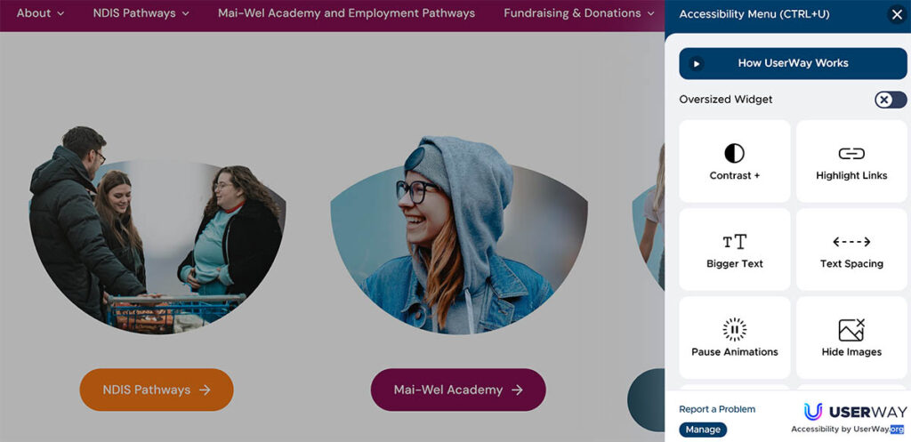
Allowing visitors to control how website content is displayed can greatly improve accessibility. Options to adjust text size, contrast levels, font style, cursor size, and animation speeds give users the flexibility to tailor websites to suit their needs and preferences.
Our professional web designers recommend providing an obvious “accessibility menu” link on every page. This should lead to a centralised control panel for modifying display parameters. Popular options include:
- Text size adjustment from smaller to larger
- High contrast colour scheme toggling
- Dyslexia-friendly font change options
- Cursor size enlarging for motor impairments
- Animation/carousel speed controls
- Saving user preferences via browser cookies to retain choices between site visits.
Write Descriptive Alt Text
Meaningful graphics with descriptive labels are vital to convey context to blind users.
Summarise photos in a concise, objective way. Links and buttons should clearly describe destination pages. Form fields should explain input purposes. Care should be taken not to overload alt text, as long descriptions risk overwhelming screen readers.
Want to make your website more accessible but don’t know how?
With inclusive design, websites can empower every visitor regardless of ability. Subtle adjustments make interacting far more equitable. Following guidance around colour, multimedia, and navigation ensures information is perceivable and understandable to all.
For information about giving your business website an accessibility makeover, contact kurl web on 1300 888 307 – home of affordable website design.
____
¹ Source: Australian Network on Disability


